This is why the website
for The Bridge Run 2025
looks the way it does
The Bridge Run 2025 doesn’t resemble any other race. Neither when looking at the route nor our website.
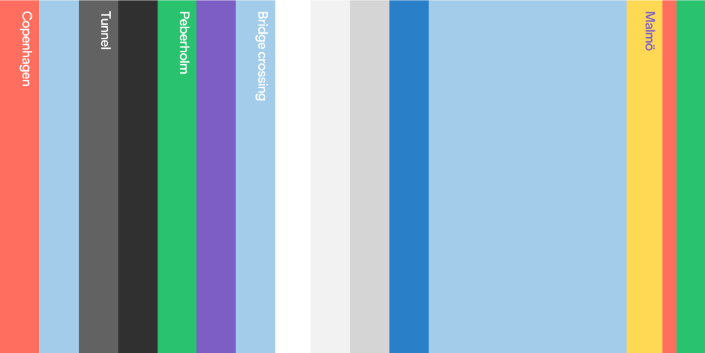
For the race, you will run through a tunnel, over a bridge, and cross a national border, while on the website, you will be greeted by a multitude of colors.
In fact, these two things have a lot in common. The many colors are actually taken from the runners’ journey from Denmark to Sweden.
If one were to draw the route with colors, it starts in Denmark with red. After that, the runners enter the tunnel. It is depicted with black and dark gray because natural daylight never reaches the large pipes at the bottom of the sea. But don’t worry – there is still plenty of light and a constant flow of fresh air when we run through June 15, 2025.

The next stop on the route is the island of Peberholm, which is home to a wide range of animals and plants that have made themselves at home in the middle of Øresund. The small natural gem has been given the green color, while the shades of white, gray, and blue represent the light, the bridge, the sea, and the sky.
And when the runners once again find solid ground beneath their feet, it happens in Sweden, represented by yellow.
So that’s why our website is adorned with all these fantastic colors. The design is created by the agency Norgram, and if you sign up for the race, we can guarantee that you will encounter these colors many times – from the starting area in Denmark to the celebration at the finish line in Sweden.